


Discover how we can turn your ideas into successful projects
Concept Lab Torino (CLT) is an innovation and development hub dedicated to transforming ideas into projects.
Located in the heart of Turin, we provide comprehensive support to designers, engineers, and start-ups through a structured approach that spans from concept creation to commercialization.






Visit our new office in Turin!
Concept Lab Torino is an innovation and development hub that has been transforming ideas into projects for over 20 years. Located in the heart of Turin, we take pride in collaborating with renowned companies and many others, offering comprehensive support to designers, engineers, and start-ups.
Our structured approach covers all phases, from concept creation to commercialization, ensuring successful outcomes. Thanks to our network of specialized partners, the use of advanced technologies like 3D printing, and a deep understanding of the market, we are the ideal partner for realizing innovative projects.
Come and discover how our experience and dedication can help turn your vision into reality!
Lungo Dora Pietro Colletta 75,
10153 Torino TO,
Italy
WORK WITH US
The quality of our work is thanks to the expertise of our specialized teams, who use the most advanced CAD software daily.
The origins of our logo
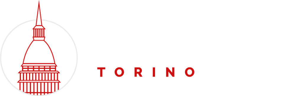
Concept Lab Torino aims to have a logo that integrates distinctive elements of the city with a modern and minimalist design.
Key factors that influenced the creation of the logo include:
- Accompanying Icon
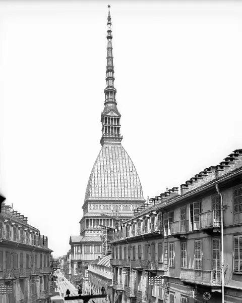
The choice of the Mole Antonelliana as the main element of the logo highlights the company’s strong connection to the city of Turin. - Use of Red
A symbol of vitality and dynamism, red was adopted to emphasize the Mole Antonelliana, making the logo instantly recognizable. - Minimalist and Modern Approach
The logo design features clean lines and a simple structure, aligned with a modern and straightforward vision. - Typographic Consistency
The Raleway font, already used in the company’s website typography, was chosen for the logo, ensuring visual and stylistic coherence. - Connection Between the Word “Torino” and the Icon
The use of the same color emphasizes the connection between the word “Torino” and the icon depicting the Mole Antonelliana, underscoring the company’s local identity.
Discover the projects and companies we’ve transformed
Learn how we’ve contributed to the success of hundreds of companies across various projects and sectors.
Check out our success stories to better understand our approach and the results we can achieve together.
